
Opening Sequence Inspiration
It was important for us to research some of the existing title sequences in Children's TV in order to produce an effective sequence of our own that will appeal to a similar target audience. After analysing the different elements of each of these title sequences, it became evident that there were recurring themes and visual components running through them. These are features that we can take inspiration from and potentially use in our own title sequence, including bright colours, distinctive and stereotypical characters and the use of special effects to represent doodles, which relates to the idea of school and youth. There is also a correlation in terms of the music used in each of these sequences, as they all use fun, energetic soundtracks - usually with song lyrics written for or relating to the program - which is reflective of a young audience. We also found that the average length of an opening sequence ranged between 30-40 seconds, which is long enough to introduce the show but isn't too long that the audience loses interest.
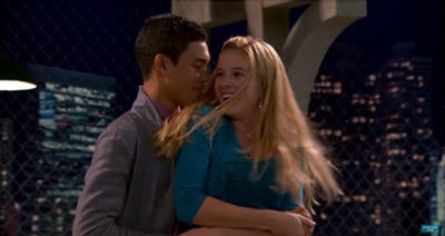
Girl Meets World
‘Boy Meets World’ was a Disney favourite for most of us, and this new sequel shares the same, sweet nostalgia and comedy as the original show, having reigned in a whopping 5.2 million views on its premiere.
The sequence allows us to be introduced to the main protagonists of the show through a series of fun clips that present each of their distinctive personalities. The scenes are connected with jump cuts, which provides an energetic pace to match the program’s themes and audience, as well as fitting with the upbeat music in the background. The soundtrack is a song by a young girl, presumably the main character, and includes the repetition of lyrics such as ‘on top of the world’ and ‘take on the world’ which relates to the title of the show as well as providing a possible deeper inspirational message for its audience.
Bright colours are a consistent factor throughout the opening, in terms of clothing, setting and props, which automatically makes the show appear more fun and lively, therefore more likely to appeal to a youthful audience. Relation to the audience is also reinforced by the repeated use of the paper aeroplane animation, which stereotypically links with ideas of school, mild rebellion and youth and creates a sense of fluency between clips.
Hank Zipzer
Possibly a less popular feature, having only aired in August 2015 on CBBC, but it is the unique elements of this british opening sequence that caught our attention.
The most noticeable element is the use of special effects in terms of doodles and cartoons which coordinate with each of the characters. Similarly to the paper aeroplane symbol with ‘Girl Meets World’, these are quite stereotypical ideas to relate with youth and school.
The deletion of frames in each of the scenes creates a jerky and somewhat inconsistent rhythm which could reflect Hank’s personality, and create a more energetic pace to match that of the program and its audience.
The children in the clip are all dressed in school uniform which immediately indicates that the program is set in a school and based around young students, which will therefore make it more relatable and appealing to the target audience.
Unlike with ‘Girl Meets World’, the soundtrack used in this opening does not consist of any lyrics, however the upbeat music is still fun in a simpler approach, and fits with the editing of the sequence.
The title of the show is simply the name of the main character, Hank Zipzer, which keeps the show clear and emphasises the idea that the plot is purely based on him and his life.
Wizards of Waverely Place
Another Disney Channel favourite, this series revolves around the themes of fantasy and magic which appear to be popular among the young audiences of today, particularly since the release of features such as Harry Potter.
Like the other sequences, we get a distinct sense of character from the opening, as well as a relation to the overall theme of the show when we see them use magic in different ways. For example, at the start of the sequence we see Justin use his magic to trap Alex in the mirror, and towards the middle, Max – the youngest character and sibling of the Russo family – uses his powers to transform his orange into a cupcake. These are quite stereotypical representations of characters around this age group, and in their given roles as siblings, and the fact that there are a range of ages in the family can make the show more relatable and appealing to a wider audience.
The use of zoom effects and graphic matches allows for a sense of fluency throughout the sequence, as well as the use of special effects and sound effects which reinforces the central theme of ‘magic’.
The background setting in each of the clips has a somewhat cartoon effect and uses bright colours, with the repeated use of the colour orange throughout, which are both elements of the sequence that make it more appealing to a younger audience.
The soundtrack used is the song ‘Everything is Not What it Seems’ sang by Selena Gomez who portrays the main character of Alex in the program. The song is catchy and very fast paced which automatically makes it appropriate for tweens, but it is the relevant lyrics that somehow provide a sense of morality and magic despite the mildly rebellious actions of some of the characters.
Liv and Maddie
Another Disney production, this series is still quite recent compared to other shows, having been released in July 2013.
The title sequence plays heavily on the stereotypes of a ‘sporty’ female character and a ‘popular’ female character, and largely centres around these two characters which implies that the show does also.
The same background is used throughout the entirety of the opening, which is unusual and unlike the other sequences that we have looked at, however we found that this provided a pleasantly simple visual and emphasised the distinct differences between characters’ personalities whilst all carrying out their domestic morning routines in the bathroom. Not only does this concept give us a better insight into each of the characters, but it makes it more relatable for the target audience.
The soundtrack that plays in the background of this opening is once again a song by the main character in the program, titled ‘Better in Stereo’, and is catchy and upbeat. The lyrics aren’t as obvious in terms of their relation to the program, however the fact that they are cheerful and positive and relate with the actions in the title sequence makes it appropriate and appealing for a tween audience.
This title consists of the two main characters' names, the twins Liv and Maddie. This is seemingly a popular feature within this genre of shows and is something we will consider within our own work.
Austin & Ally
Another Disney installation, this time a musical-themed series centred around two young musicians.
The most distinctive feature of this title sequence is the use of bold colours and busy patterns in the background, which reflects the lively and energetic personalities of each of the characters, as seen in the clips.
The camera angles that are used are quite varied, ranging from close ups of the character’s faces and hands, when clapping and holding hands, with the addition of a few full-body shots. The dynamic between characters in this opening immediately labels the characters as a group of best friends, which makes the program more fun and relatable for a young audience to watch.
Once again, the music used in the background is a song by one of the main characters with lyrics revolving around friendship, which not only relates to the general theme of the show, but makes for a more inspirational and likeable soundtrack for the young audience.
Here, the title of the show consists once again of the names of the two main characters, Austin and Ally.
Shake it Up
Disney Channel bring another Arts-based show with ‘Shake it Up’, which originally aired in 2010. The series centres around two best friends, Rocky and Cece, who star as background dancers on a popular television show titled ‘Shake it Up’.
A similar style to the ‘Girl Meets World’ sequence, it primarily consists of a compilation of action clips of each of the characters from the show, however the fact that most of the clips feature Rocky and Cece, and that the sequence ends with both of these characters on screen with the logo immediately tells us that these girls are the stars of the show.
Jump cuts are used to compile each of the clips, which offers an energetic pace to reflect the themes of the show including dancing, as well as the youth of the characters in the program and the audience who will be watching it. The clips are also compiled in a way that fits with the rhythm of the music, as when the music increases in tempo and becomes more upbeat, the scenes tend to quicken in pace and represent the characters in more energetic situations.
The song used in the background is titled ‘Shake it Up’, which evidently relates to the program’s title, and the lyrics are also relatable to dancing, which is another major theme of the show. However, unlike most of the other opening sequences that we have looked at, the song is not sang by one of the characters from the show – but by Selena Gomez, another popular Disney star. The upbeat temp of the soundtrack as well as the fact that it is sang by a strongly admired female character means that it is more suitable and appealing for a tween audience.


The graphic match transitions between each character provides a closer look at the Russo home as well as creating the illusion of magic by suggesting that one object can transform into another.


This editing technique also offers a sense of personality for the characters, particularly in the screenshots shown above and below. Above we see the image change to that of Max, the youngest member of the Russo family, holding an orange, which he later changes into a cupcake with his powers. This fits with the stereotype of a young, mischevious boy and makes his character seem more entertaining.


In the next graphic match shown above, the transformation focuses on Harper's character and in particular - her outfit. Once again this provides a more authentic sense of character, as those who have already seen the show will know that Harper's character is most commonly known for her unique dress sense. Already we are given an overview of each character's personality before we see them in action. This could be an idea to consider for our own opening sequence, so that our audience can feel like they know the characters even before watching an episode of the show. This is particularly important when it comes to a young target audience.

Special effects are used in this title sequence from the get-go. The first frame of the sequence is that of a steamed-up bathroom mirror, which Liv's character then clears with a hairdryer. When she does this, it is revealed that the characters are actually in their bathroom, and the camera angle acts as though we, as the audience, are behind the mirror. This provides a unique perspective and makes the opening feel more interactional, which would be more entertaining for a young audience.


Another large contributing factor to this particular opening is the use of direct contrast between the two main characters. Looking at the mise en scene of these frames, their outfits alone show a clear divide between these two personalities. For example, the contrast in costume, (the pink feminine top and basketball shirt), as well as props, (mascara in contrast to basketball). However, the use of facial expressions shows that these two characters are still happy in one another's presence, which is an interesting concept that will likely intrigue the audience. This use of contrast is also a positive element of a children's show because it immediately opens it up to a wider audience, as more people with different personalities will still have a character to relate to on the show. This is an element that we could consider for our own title sequence, by providing characters that are relatable for our audience.


One of the consistent effects used throughout this title sequence is where the characters hold cards with their names on them. This is a unique method to display text in the clip, and makes it more interactive rather than just having written names layered over the screen. Bright colours and doodles are also repeated throughout the opening, and are both stereotypically related to a younger audience. The doodles in the background vary throughout, but mostly represent different aspects of whoever’s character is on screen at that time. These are all effects that we could consider using in our own title sequence, as they would appeal to our target audience.


The transitions used in this opening are quite unique, in that they once again involve the card props and offer a fun interpretation of each character being printed on the cards. Although this would not necessarily relate to our school theme, it could still be a transition to consider in our sequence for a more interactive effect on our audience.
Jonas
While the show itself may not be one of disney's most popular productions, its three main stars definitely were.
The Jonas Brothers star in this music-based show, starring as, unusually - themselves!
In terms of colour and mise en scene, the sequence is very simple, consisting of mostly blue and white colours, stereotypically representative of boys, thus linking to the three main stars of the show. Given the fact that we are not aiming our show at any particular gender, it would probably be best if we avoided the use of one stereotypical colour alone, as done here.
However, in terms of special effects, this opening is quite advanced. A blue ribbon is present throughout the entire sequence which once again reinforces a stereotypically 'boyish' theme, while the ribbon itself insinuates liveliness and could relate to the music theme.
Fast paced edits and overcranking are used for maximum effect in this sequence, which immediately makes the characters seem more energetic and therefore more enjoyable for a young audience to watch.
As seen with most of the other sequences that we looked at, the soundtrack is sang by The Jonas Brothers themselves, which makes the characters seem more interactive with the audience. The title of the song is 'Live To Party' which adopts the fun and carefree attitude that might be stereotypical of a teenager, particularly a teenaged boy, therefore making it more likely to appeal to its audience.
The title of the show originates from the last name of the three brothers who are the main characters.
The Brady Bunch
A much older show from 1969, which didn't hit it's highest ratings until the show was cancelled and went into syndication, where it proved to become highly popular with children and teenage viewers and led to the production of several reunion films and spin-off series'.
This classic sequence introduces the characters with close-up shots of each individual giving eye contact with the camera and seemingly interacting with one another.
The soundtrack consists of an introductory theme tune which was originally the most popular choice to play over opening sequences as it summarises the show in a catchy form for the audience.
The layout is simplistic and reflective of it's time period and is suited to the targeted family audiences well.
The title is named due to the last name of the family it is based around, the Brady family.
Freaks and Geeks
Released for one season across 1999-2000, this show had a positive reception and ranked #93 in ratings during its only season, managing to boost many of the stars into successful television and film careers.
Set in 1980, this opening sequence depicts each character having their high school yearbook photos taken, showing a brief introductory summary of the characters to the audience.
The soundtrack was chosen carefully to reflect the rebellious nature of the period through the use of "Bad Reputation" by Joan Jett, giving the sequence a unique overview.
Good Luck Charlie
Quite a current and popular Disney production, 'Good Luck Charlie' is a very family-orientated show with just the right amount of humour to keep children entertained.
Unlike the other sequences that we have looked at, this one begins with an establishing shot of the Duncan family home which automatically tells the audience that this show will be based in an everyday household, as well as providing clues to the main themes of the show. A zoom effect is then used as the camera ‘enters’ the home, which also makes the audience feel like they are stepping inside the Duncan household, thus taking a more personal and interactional approach.
The consistent use of photo frames throughout the title sequence further reinforces the idea of family, as well as insinuating a sense of magic, as the photos in the frames come to life. Although the show is not magic-related in any way, this could be a representation of the liveliness of the family on the show, as well as families in general. The use of fast-paced edits between clips and bright colours also supports this idea.
The camera also appears to zoom at different angles from frame to frame which provides a sense of disorientation, which could reflect the craziness of the Duncan family and their unique personalities as individual characters. The general pace of the sequence is something that will keep children intrigued and entertained, and is something that we should look to replicate in our own piece.
The soundtrack in the background of this opening is, predictably, a song by the star of the show – Brigit Mendler – and is titled ‘Hang In There Baby’. The song is not only upbeat and cheerful, but the lyrics are relatable in terms of the themes of the show, as well as in terms of real families. This will appeal to a young audience, as it represents real families in a fun, energetic light.
The title derives from the plot of the show, where a teenage girl creates videos documenting the family for her younger sister Charlie to watch when she is older. in relation to this, each episode is ended by someone, usually the main character, saying the title line 'Good Luck Charlie'.


Drake & Josh
This Nickelodeon installation was a great success, following the lives of two stepbrothers which has risen to become quite a relatable subject within the target audiences.
Throughout the sequence the two brothers are shown to have contrasting personalities, yet through the use of clip montages from the show are shown to stick by each other despite these differences, which is a theme of the programme.
The editing is fast paced and consists of sweeping transitions to set the tone of the show, which is also reflected through the soundtrack. The song 'I Found A Way' was written as the theme with influences from pop/punk music and sang by the star, Drake Bell, and reinforces the ideas portrayed by the sequence and appeal to the target audience.
Once again, this is a show who's title is derived from the names of the protagonists.
H2O: Just Add Water
This Australian dramatic fantasy show for children and teenagers centred around three teenage girls. The programme was originally only planned for 2 seasons but due to popular demand produced a third season to conclude the show, and it's success was shown through it's international syndication, reaching an audience of over 250 million and has also resulted in the creation of two spin-off series and several children's books.
This opening sequence consists of a montage of shots from the show to introduce the concept of the programme in a short but effective summary.
Similarly to the previously stated shows, this opening shows transitions in the form of graphic matches, dissolves and jump cuts, which all seem to be consistently used throughout the opening sequences of shows aimed at young audiences such as ours.
The show was filmed at local locations such as at Sea World and around the Gold Coast. The song 'No Ordinary Girl' was written as the theme to further depict the ideas of the show, fitting well against the editing of the sequence and producing an overall appealling product aimed at it's targeted audience ranging from children through teenagers.
The sequence opens with a simplistic frame showing the title which then transforms into a paper aeroplane which is present throughout as a link between clips. Below the aeroplane is shown flying through New York City to introduce the setting to the audience within the opening sequence. Each star is established through a compilation of clips from the show paired with their names to identify them. The final frame of the sequence brings all the previous elements together in one final summary of the show's characters and themes.


The repeated use of photo frame imagery throughout the sequence highlights the family concepts of the show. At the end of the sequence, the Duncan family are all shown together in a single shot on the stairs, which allows the personality of each individual family member to shine, therefore offering a better introduction for the audience. When the picture is taken, it is once again shown on a frame on the wall for the last part of the sequence, before it seemingly falls off one of the hooks. This suggests that the Duncan family are not perfect in any way, which not only makes for a more entertaining show, but makes it more relatable for the audience.
Something quite unique about this title sequence is the consistent use of eye contact from the characters, which is particularly unusual for the type of sequence which is compiled with a series of existing clips from the show. However, in this instance it works well and allows the audience to feel more connected to the characters, as well as getting a better sense of their personality. This is a technique that we could consider using in our own sequence.
Naturally, the most common theme throughout this opening is dance-related. Almost all of the clips of each character consist of some element of dance, whether this be in a serious way or a silly way. Not only does this tie in perfectly with the primary theme of the show, but it shows a fun and lively side to each character, which is most likely to appeal to a young audience.


Another feature of this title sequence is that when each character is introduced, their props and/or actions are very representative of their personalities. This shows the clear distinction between them and allows the audience to already choose who they identify most with or who they find the most entertaining. Using props in this way could be something to consider for our own piece in order to provide the audience with a better sense of character from the get-go.
Similarly to the Shake It Up sequence, eye contact is used rather consistently throughout this opening sequence. One of the first shots is an extreme closeup of all three Jonas Brothers - a.k.a. the main characters of the show. The effect of this closeup paired with their facial expressions almost looks as if they were to be taking a 'selfie', which gives a fun and youthful vibe that can be recognised and related to by the audience.


The grouping of characters in grids shows the links between them, separating them into two and then joining them together in the final grid in a brisk symbolistic summary of the show. The title stands out against the grid layout and the font expresses the targeted audience in a suitable manner, using the same font style to introdroduce the starring cast.


Each member of the cast is introduced in a short sequence which follow the same conventions, showing their names over the preperation and then the taking of the picture. The font used is simplistic and suits the targeted audience, which is reflective of the sequence. The final shot shows the final pictures in a yearbook layout , which is a great way of emphasising the setting of the show.


The use of a blue/green colour scheme supports the male dominance of the show, and sweeping transitions using arrows create a consistent theme throughout the opening, linking the clips together in a montage. These arrows are used throughout the introduction of the cast, coupled with shots ranging from close-ups to group shots to depict the show.

The Story Of Tracy Beaker
The Story of Tracy Beaker is a television show which first aired in 2002 on CBBC, new episodes were created up until 2007. This is one of the most popular british shows and one of CBBC’s most popular shows overall as the channel continues to air the original series with spin offs such as Tracey Beaker Returns and The Dumping Ground.
The sequence introduces us to multiple characters and their place in the main characters world. They are introduced with a 'doodle' prop such as phones for the mean girls and a camera for the main character. Similar doodles continue to fall behind them as representations of the characters. By introducing doodles into our product we would be keeping in line with a typical children’s television show.
This is another example of a show where the title includes the name of the main protagonist.


In one section it introduces the characters as cartoons in a thought bubble behind the main character thinking. This indicates that this is her perception of each person and their role in her life.
The final part of the opening sequence sees the title in a flashing boarder. This is effective as the main character acts as if she is the star and this reflects her personality; which is effective as it reinstates that the show is all about her character.
The Next Step
The Next Step is a reality style drama which is shown on CBBC. It follows a group of dancers at their dance academy and their lives outside of the academy.
The opening sequence introduces the characters with a plain white back ground, their name in lights and them doing a dance move. Having their name in lights is effective as it suggests each character is trying to be a star and that is their aim when leaving the academy. Many young people may idolise these characters as they may have a dream of being a dancer so find it easy to relate to the characters.
The characters take the role of many stereotypes. For example Emily is the stereotypical mean blonde who is captain of the dance team. By sticking to stereotypical characters it creates the frameworks of the dynamics between each of the characters.


The actors are all dressed in dance clothes such as leggings. This further shows their characters passion for dancing and their role within the show. By showing off each of their talents it defines them more instead of just another person who can dance.
The final shot is of the entire cast together under the title of the show. This is effective as it shows them together as a group and shows the relationships between each person.
The music used is upbeat and is something you could easily dance to. This is effective as it relates back to the show as it is about teenagers and their dancing careers.
We found the use of a paper aeroplane and the graphic representation of a world to reinforce the title highly inspirational, which is seen through their use in our own productions. This is due to the target audience suitablilty and the connotations of which have been stated in our analysis to the left.
The fast pace of the editing matched the fast paced soundtrack, which keeps the audience interested throughout. This is something we would like to show throughout our own editing as we feel that a slow paced opening sequence may cause boredom and would therefore result in an unsuccessful produt.
This font is much like the font we envisioned using within our own work, as this is clear and representative of our target audience and adds a unique atmosphere by appearing to be handwritten.
The use of zoom techniques is something we would like to emulate within our own production as this adds excitement and makes the pace seem much quicker, keeping focus and interest from the audience.
By finding inspiration in their effective use of characterisation, we could provide a much more suitable opening sequence which our audience could relate to in a more effective manner. This ease into relatable characters would spark interest in our production and provide entertainment, which would be one of our main goals in producing a successsful opening sequence.
Their identifiable colour scheme and frequent use of doodles matched to the interests of each character is something we would like to use in our own work to reinforce the representation of our charaters.
We liked the composition of this sequence, introducing each character one by one through close-up shots including eye contact with the camera, but ultimately by showing the main characters as the main feature by starting and ending the sequence with shots of them (along with several clips in the middle of each character introduction). We would like to use this composition as inspiration when creating our own opening sequence as we found this to be a highly effective and suitable manner of presenting the sequence.
We feel that an instrumental track would be the most suitable and effective choice in our own work as this is much less limiting and means that we do not have to cast a main character who was a good singer - as most songs including lyrics are sung by the main character.
Summer in Transylvania
This British dramatic fantasy show for children and teenagers centred around the human protagonist, Summer, and several supernatural teenagers. The programme was aired on Nickelodeon and consisted of only one season.
This opening sequence consists of a montage of shots from the show split up by introductory shots of each main character.
In this opening sequence many jump cuts are used to transition between these clips.
The song 'Summer in Transylvania' was written as the theme to further depict the ideas of the show and was sang by the main protagonist, fitting well against the editing of the sequence and producing an effective result aimed at it's targeted audience.
The title of the show also includes the name of the protagonist, a feature which has proven to be a popular choice within children's TV dramas.

Close-up shots of the characters used after group shots of the three girls introduce their status as the main characters before showing the title screen to introduce the show. The characters are then revisited within the montage of scenes and the cast are credited in shots such as the one shown below. The costume choices are well reflective of the girls, dressed in average clothing to represent the normality of the teenagers and then in impressively produced mermaid costumes which contrast to their otherwise normal appearance which is appealing to their target audience.


A shot of the location is used to set the scene of the show and shows strong use of mise en scène. The characters are also introduced by freezing the scene and showing the individual's name and supernatural status to further the concepts of the show. Close-up and mid shots of the characters are used throughout the montage as this is a common convention to used in children's TV dramas. Devoleping on this point, this show is an example of how strongly mise en scène is used throughout this genre of TV shows as shown through the use of characterisation via acting, costume, lighting and location choices.


The Worst Witch
The Worst Witch is a british TV series produced by ITV about a group of young witches studying at a school for magic and is based on The Worst Witch books by Jill Murphy. This show was preceeded by the ITV show Weirdsister College following the protagonist when she starts university, and by a more recent CITV show, The New Worst Witch, which follows the protagonist's younger cousin who starts to study at the academy. BBC are also planning to develop a new series, showing the success of the franchise.
This opening sequence shows mostly long shots of the protagonist and other characters flying to the academy on broomsticks, showing instantly the concept of the show.
In this opening sequence only a few clips were shown and had a slow pace throughout.
The song is sang by a choir and further demonstrates the concepts of the show, giving a traditional british school vibe to the sequence.
The Mysti Show
This british drama was shown on BBC and CBBC and was based on Mysti, a half-human half-fairy, and her friends. The show also managed to combine magazine and narrative elements within, leading to it's unique success with it's target audience, however these elements were dropped for the second series to shorten the length of episodes from 1 hour to 20 minutes.
The opening sequence uses many close-up, mid and long shots as the characters are introduced. A strong colour scheme is used throughout alongside special effects which is appealing to the target audience of the show.
In this opening sequence, transitions are used effectively through smooth swipes and special effects to maintain the fast pace.
The song is sang by a female to emphasise the female main character and appeal to the primarily female audience. Interestingly, this opening sequence also uses sound effects to match the special effects, which is not found within most shows of the same genre and offers a unique feel to the opening.
The name of the show is based on the main character, Mysti, a common feature within the titles of children's TV shows.


The pink, purple and white colour scheme can be seen throughout alongside the mixture of close up, mid and long shots to introduce the characters. There are basic special effects used such as doodle images (e.g hearts, stars, lips and cherries), glowing orbs and sparkles to further demonstrate the concepts of the show and attract the target audience. Eye-contact is also shown throughout, which is a feature sometimes used within children's TV drama shows and is something we would like to consider within our own work to give a more unique feel to our sequence


Genie in the House
Genie in the House is a british children's TV show shown on Nickelodeon about two teenage sisters who find a lamp containing a genie and make wishes which often get them into trouble.
This opening sequence is similar to that of The Mysti Show, using close up, mid and long shots when introducing the characters. A strong colour scheme is also used again throughout the sequence alongside special effects which is appealing to the target audience of the show.
In this opening sequence, transitions are once againused effectively and smoothy, with the characters 'interacting' with the special effects as a more entertaining feature.
The theme song is sang by one of the main characters and is written to emphasise the sequence and the show's concepts to appeal to the target audience.


The yellow/orange and blue colour scheme can be seen throughout alongside the mixture of close up, mid and long shots to introduce the characters. There are basic special effects used such as faded doodle images in the background (such as flowers), glowing hands and fog (etc.) to further demonstrate the concepts of the show and appeal to the target audience. Like Wizards of Waverly Place, the characters can also be seen interacting with these special effects, which gives the show a unique vibe. Eye-contact is once again shown throughout, a feature sometimes used within children's TV shows and something we will consider within our own work to give a more unique feel to our sequence. The title scene is shown at the end of the sequence, which is a feature we would also like to consider when producing our own opening sequence.

