
Fonts
When looking for fonts, we went to dafont.com and searched for fonts that we thought looked similar to doodles and would fit in well with the theme of our opening sequence. We did this as this would match our ‘doodle theme’ throughout. We found 20 different fonts and previewed them all in our coursework to decide which ones we liked best and which ones we felt matched what we were trying to create. These fonts were all considered in terms of our opening sequence as well as our ancillary products.


As a group, we collectively decided to use ‘Lemon Yellow Sun’ for the title on our ancillary products and main product. We compared all the different fonts and decided that this font was best for our title as it looked natural enough to be handwriting or a doodle, yet it was clear and bold enough to stand out as a title.
We decided that we would use different fonts for the names of different characters in our opening sequence and collectively decided which ones fit best with each character. This added more variety to our main product rather than just using the same font throughout which we thought could look repetitive or boring.


Main Character Font - Buxton Sketch
We chose this font for our main character Nora because we thought although it was quite simple and easily readable, the general shape and outline made it look quite different, which represented Nora's character well.
Sporty Font - Gungsuh
We were initally going to use the font on the right for our character Will, but concluded that the clean-cut typewriter appearance made it look more geeky than sporty. We then changed to a thicker font with a bolder outline for a more stereotypically masculine appearance, and renamed our athlete as 'Tyler' to fit accordingly.
Alternative Font - Gregor Miller's Friends Font
For our 'alternative' characters we decided on quite a unique font to match the personalities of these characters. The font looks almost like it has a drip effect which gives off a somewhat dark vibe to fit the stereotype of our characters.
Arty Font - MV Boli
For our 'arty' character we chose quite a simple font with a smooth outline to almost give the effect as if it had been painted. The style almost appears handwritten or drawn which again fits with the stereotypical traits of this character.
Geek Font - Fixedsys
The font we chose for our 'geeky' characters is quite unique and appears as though it were to be made up of pixels which gives the impression of a computer game of sorts, therefore making it stereotypically fit with these characters.
Popular Font - Vladimir Script
The font used for our 'popular' characters is very smooth and stereotypically feminine due to the italics and 'curly' appearance which fits with the representation of these characters in our title sequence.
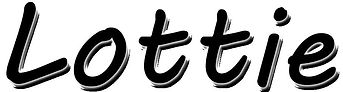
Main Title
Character Names
